Testing Font Styles in Meta Ads: A Guide
Test and optimize font styles in Meta ads with A/B tests, clear goals, and design tools to improve readability, CTR, CPA, and ROAS.
Fonts can make or break your Meta ads. The right font improves readability and drives higher engagement, while poor choices hurt performance. For instance, switching from decorative to standard fonts boosted a SaaS company's leads by 209% in 2024.
Here’s what you need to know:
Serif fonts convey trust and authority, ideal for finance or law.
Sans-serif fonts feel modern and simple, perfect for tech or younger audiences.
Script/display fonts grab attention but can hurt readability in long text.
How to test fonts in Meta Ads:
Set a clear goal based on Meta ads benchmarks (e.g., CTR, CPA, or ROAS) and allocate ~20% of your budget, following strategies for scaling small budgets.
Use Meta’s A/B testing tool to isolate fonts as the only variable using an AI testing framework or use dynamic creative optimization to test multiple elements.
Let tests run for 7–14 days or until you gather 100+ conversions per variation.
Scale successful fonts by increasing budgets or exploring new audiences.
Tools like Canva, Adobe Express, and AdAmigo.ai can simplify font testing and optimization. By focusing on legibility and audience preferences, you can refine your ads for better results.
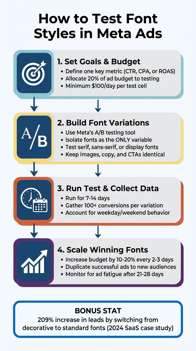
4-Step Process for Testing Font Styles in Meta Ads
Font Style Categories and When to Use Them
Knowing the three primary font types can help you align your typography with your brand's personality and your audience's expectations. Each style brings its own psychological cues, influencing how your message is received and how visuals impact Meta ads compared to copy. These insights are essential for fine-tuning your A/B testing in Meta ads.
Serif Fonts: Trustworthy and Established
Serif fonts, like Times New Roman and Georgia, feature small strokes at the ends of their characters. These details convey a sense of authority and reliability - qualities that are especially important in industries like finance, law, education, and luxury goods. If you're aiming to highlight expertise or tradition, a serif headline can help reinforce that message. This contributes to your overall Meta ads ROI optimization by building immediate credibility.
Sans-Serif Fonts: Clean and Modern
Sans-serif fonts, such as Arial, Helvetica, and Open Sans, eliminate the decorative strokes for a sleek, straightforward look. This style feels fresh and approachable, making it a great choice for brands that want to emphasize simplicity and innovation. Plus, their clarity on mobile screens makes them ideal for Meta ads, where most users view content on their phones. They’re particularly effective for reaching younger audiences. This alignment is a key part of how AI matches creatives to audiences for better engagement.
Script and Display Fonts: Bold and Eye-Catching
Script and display fonts are designed to grab attention, making them perfect for headlines. However, they can be harder to read in longer text blocks. To strike the right balance, use these fonts sparingly and pair them with simpler options for body text. When creating font variations for Meta ads, focus on how these styles can enhance your message without sacrificing readability.
Setting Up Font Style Tests in Meta Ads Manager
When testing font styles in Meta Ads Manager, it's important to isolate typography as the only variable. This way, you can accurately measure its impact on performance.
Set Test Goals and Budget
Start by defining a single key metric - something like click-through rate (CTR), cost per acquisition (CPA), or return on ad spend (ROAS). Focusing on just one metric makes it easier to interpret the results. Plan to allocate about 20% of your ad budget to testing. This ensures you gather enough data without disrupting your main campaigns. Meta suggests spending a minimum of $100 per day per test cell to achieve statistically reliable results.
Build Font Variations
To create font tests, go to an existing ad in Meta Ads Manager, click "Duplicate," then select "New A/B Test" and choose "Creative" as the variable. This setup ensures your audience is split evenly for a true comparison. Create multiple ad variations by changing only the font style (e.g., serif, sans-serif, display), while keeping other elements - like images, copy, and calls-to-action - the same. If you're using banner overlays, Meta's "Image template" tool under Advantage+ Creative makes it easy to tweak fonts and colors.
However, steer clear of heavily stylized Unicode fonts (like 𝔽𝕒𝕟𝕔𝕪 𝕋𝕖𝕩𝕥), as they can flag spam filters and hurt performance. For instance, an Austin fitness studio saw big improvements in March 2024 after switching from Unicode to standard fonts. Their organic reach jumped from 690 to 1,940 impressions per post, and their cost per signup dropped from $8.40 to $4.20 over 12 weeks.
Run the Test and Collect Data
Once your test is live, let it run for 7–14 days to account for differences in weekday and weekend behavior. Aim for each variation to generate at least 100 conversions before making any decisions. If you’re not using Meta’s built-in A/B test tool, manually set up separate ad sets with identical targeting for each font variation. This ensures an even budget split, as Meta’s algorithm might otherwise favor one ad over another.
When the test concludes, review the data to identify which font style performed best. This will give you clear insights into how typography influences your ad results.
Reading and Acting on Font Test Results
Now that you've run your font tests, it's time to dig into the results and decide on your next steps.
Review Performance Metrics
Using the data from Meta Ads Manager, evaluate how each font variation performed. Focus on your primary metric - whether it's CTR, CPA, or ROAS - and look for clear differences between the fonts. The top-performing fonts will show noticeable improvements in these metrics.
For example, one test revealed that ads using a script font had a 61% higher CPA ($42.61 compared to $26.41) and a lower ROAS (2.6× versus 4.2×) due to readability issues. If you notice similar trends - higher costs and lower engagement - it likely means the font is making your ads harder to read and less effective.
Keep an eye out for signs of ad fatigue, too. If a font performs well initially but starts losing effectiveness after 21–28 days, or if ad frequency climbs above 3–4 impressions per person per week, it’s a signal to refresh your creative with a new font variation.
Expand Winning Font Styles
Once you've identified a font that delivers strong results, it’s time to scale its success. Begin by gradually increasing your budget - aim for a 10–20% boost every 2–3 days. Then, try horizontal scaling by duplicating the successful ad and targeting new audiences or placements. This strategy can help you discover additional groups where the font resonates just as well.
To make scaling easier, consider using AdAmigo.ai. This AI-powered platform simplifies the process by monitoring performance, identifying top-performing ads, and launching new variations with a single click. It also automates tasks like budget adjustments and audience expansion, saving you time while keeping your campaigns moving in the right direction.
Tools for Font Style Testing
Finding the right tools can make font testing in Meta campaigns much more efficient.
Meta Creative Testing Tool
Meta's A/B testing feature, located in the "Experiments" section of Ads Manager, allows you to test 2–5 font variations simultaneously while ensuring equal budget distribution. This setup prevents the algorithm from favoring one variation too early, giving you more reliable results. To get meaningful data, aim for at least 50 optimized events per week by allocating enough budget. Once the test is complete, you can review metrics like Cost Per Result and CTR in the Experiments dashboard to identify the best-performing font style.
Before launching your campaign, tools like Canva and Adobe Express can help you create polished font variations.
Design Tools: Canva and Adobe Express
Both Canva and Adobe Express simplify the process of designing professional ad mockups with various font styles. Canva's grid feature (found under Elements > Grid) ensures that your layouts remain consistent across designs. Meanwhile, Adobe Express offers pre-made templates that help maintain your brand's visual identity as you experiment with different typefaces.
If you're looking to take automation to the next level, AI agents that test creatives can streamline font testing even further.
AdAmigo.ai for Automated Font Testing
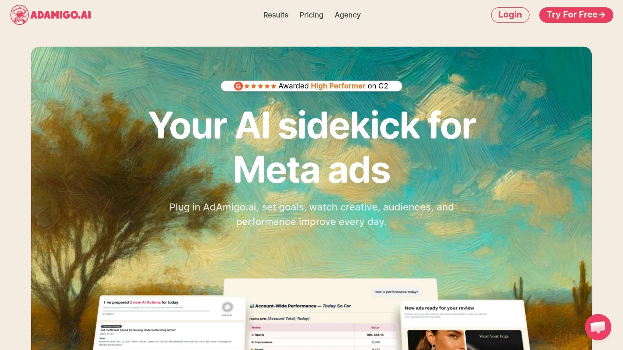
AdAmigo.ai (https://adamigo.ai) takes font testing to an entirely new level by automating the process. Its AI Ads Agent analyzes your brand identity and past top-performing ads to generate new creatives with optimized font choices. It doesn't stop there - AdAmigo launches fully configured ad creatives directly into your Meta campaigns and continuously optimizes them based on live performance data.
With features like AI Actions, the platform provides a daily to-do list of impactful tweaks, including font adjustments, based on real-time metrics. For agencies juggling multiple clients or in-house teams with limited bandwidth, this tool can be a game-changer. By automating creative production, monitoring, and scaling, AdAmigo enables a single media buyer to manage 4–8× more accounts while the AI takes care of execution around the clock.
Conclusion
Typography plays a key role in expressing your brand’s personality, fostering trust, and emphasizing important details. Testing font styles in Meta ads helps you uncover what resonates most with your audience while ensuring that poor typography doesn’t overshadow strong visuals or messaging.
Here’s a simple approach: define your Meta ads campaign structure, create font variations using tools like Canva or Adobe Express, use Meta’s A/B testing feature to test your ad CTAs, and analyze the results to determine what works best. Fonts evoke different psychological reactions, so testing ensures you’re aligning the right style with your brand and audience. Once you’ve nailed the basics, automation can make testing even more efficient.
Platforms like AdAmigo.ai (https://adamigo.ai) take this a step further. They analyze your brand identity and top-performing ads to generate new creatives with optimized font selections. These tools launch and refine campaigns using real-time data, allowing a single media buyer to manage multiple accounts while the AI handles execution 24/7.
Consistency is key - test often, adjust based on data, and ensure your ads are mobile-friendly with fonts that are easy to read on smaller screens. Over time, these efforts will give you a clearer understanding of what drives engagement, and your ad performance will improve as a result.
FAQs
What’s the best font size for Meta ads on mobile?
For Meta ads designed for mobile, keep your primary text concise - around 70 to 100 characters is ideal. Pair this with an image size of 1080x1080 pixels for feed ads. This combination enhances clarity, boosts engagement, and ensures your ad looks great on mobile screens.
How do I keep fonts consistent with my brand in ads?
To keep your ads visually cohesive, stick to font styles that reflect your brand's personality and use them consistently across all materials. Experiment with A/B testing to identify fonts that connect well with your audience while maintaining readability and a clear visual hierarchy. Consistent font usage not only strengthens brand recognition but also adds a sense of professionalism. Thoughtful decisions about font size and hierarchy can make your ads more engaging and improve their overall impact.
When should I stop a font test early?
When running a font test, it’s smart to stop early once you’ve gathered enough data to make a clear decision. For instance, if you've hit a solid benchmark - like 500 conversions - or if one font style is clearly outperforming the rest in engagement metrics, there’s no need to continue. Similarly, if the results show no noticeable differences or have already reached statistical significance, wrapping up the test can save both time and resources.