
Checklist for Optimizing Landing Pages
7-step checklist to improve headlines, CTAs, mobile design, page speed, trust signals, and A/B testing for higher conversions.
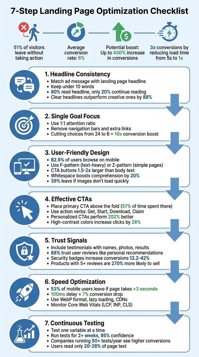
Your landing page is where clicks turn into conversions. But here's the challenge: 51% of visitors leave without taking any action, and average conversion rates hover around 6%. A few key changes can make all the difference - boosting conversions by up to 400% or tripling them just by reducing load time from 5 seconds to 1.
To help you get started, here’s a 7-step checklist for creating high-performing landing pages:
Headline Consistency: Match your ad's message with the landing page headline. Clear, benefit-driven headlines outperform vague ones.
Single Goal Focus: Simplify your page by sticking to one primary goal. Remove distractions like extra links or navigation bars.
User-Friendly Design: Guide visitors with layouts that direct attention to key elements. Ensure mobile compatibility for the 82.9% of users browsing on phones.
Effective CTAs: Use clear, action-oriented call-to-action buttons. Place them above the fold and test their wording, color, and size.
Trust Signals: Include testimonials, security badges, and social proof to build credibility.
Speed Optimization: Slow pages lose visitors. Compress images, use caching, and optimize for mobile to cut load times.
Continuous Testing: Run A/B tests on Meta Ads and analyze user behavior with tools like heatmaps to refine your page over time.
These steps focus on reducing friction, aligning with user expectations, and leveraging data for improvement. Start with small tweaks - like headline clarity or CTA placement - and let testing guide your next moves. Even minor changes can lead to major gains in conversions.
7-Step Landing Page Optimization Checklist
1. Match Your Headline to What Visitors Expect
Keep Your Message Consistent
When someone clicks on your ad, they arrive with specific expectations. If your landing page headline doesn’t immediately confirm they’re in the right place, they’re likely to hit the back button. This is where "message match" comes into play - it’s all about ensuring your ad copy and landing page headline align perfectly. Andrea Larsen from UFO Performance Marketing sums it up well:
Your headline is the digital handshake of your landing page.
In other words, your headline serves as the first impression and must immediately reinforce the promise made in your ad.
The solution is simple: use the exact wording from your Meta ad copy in your landing page’s H1 tag. For example, if your ad says "50% Off Winter Coats", your H1 should say the exact same thing. Avoid vague alternatives that might confuse visitors. Research backs this up - Sumo analyzed over 150,000 opt-in headlines and found that clear, straightforward headlines outperformed their more creative counterparts by 88%:
The headline "Free Ebook: 15 Emails Everyone Should Send" converted at 15.42%, while the more creative alternative "Why Aren't You Sending These 15 Emails?" only managed 7.1%.
Since visitors spend 57% of their time above the fold, your headline must deliver instant clarity. Remember, 80% of people read the headline, but only 20% continue reading. This makes it crucial to keep your headline short - ideally under 10 words. And for mobile users, where space is even more limited, clarity becomes even more important.
A clear, consistent headline sets the stage for writing copy that directly communicates benefits.
Write Clear, Relevant Copy
When it comes to headlines, clarity wins every time. Your headline should answer two key questions: "What is this?" and "What’s in it for me?" Laith Wallace from FlowConverts explains it best:
Your copy should feel like a one-to-one conversation. Ask: What's their biggest problem? What's their dream outcome? Use their words, not corporate jargon.
Stick to proven formulas that emphasize benefits and outcomes. For instance, a headline like "Increase ROAS by 40% in 30 Days" (Benefit + Timeframe) or "Tired of Wasted Ad Spend? Here's the Fix" (Problem + Solution) gives visitors a clear idea of what they’ll gain. While your subheadline can provide additional details or emotional appeal, the main headline must deliver the core message. If visitors can’t grasp your page’s purpose in 5–10 seconds, it’s time to simplify.
Finally, monitor bounce rates for paid traffic. A sudden spike often indicates a mismatch between your ad’s promise and what your landing page delivers. When your headline and copy align with visitor expectations, you’re far more likely to keep them engaged.
2. Focus on One Goal Per Page
Pick One Main Goal
Every landing page should have a single, crystal-clear purpose. Whether you're aiming to collect email addresses, sell a product, or secure demo requests, juggling multiple goals only leads to confusion. Studies show that cutting the number of choices from 24 to just 6 can boost conversions by up to 10 times.
This is where the 1:1 attention ratio comes into play. It's the balance between the number of actions a visitor can take on a page and the one action they should take. To maintain this balance, remove navigation bars, eliminate unnecessary links, and strip away any elements that don't directly support your primary goal. As ConvertCart puts it:
Too many decisions freeze people; a few clear ones move them forward. That same principle applies directly to your landing page: more CTAs = more thinking = more abandonment.
Start by aligning the page's focus with your current business goal. Running a seasonal sale? Make that the sole focus of the page. Building your email list? Ensure lead capture is the only action available. Your goal should also match your visitor's intent - whether they're researching (informational), comparing options (commercial), or ready to buy (transactional). Audit the page for distractions like social media links or footer navigation that could divert attention from your main objective.
Once your goal is clear, communicate its unique benefit to visitors immediately.
Write a Clear Value Proposition
Your value proposition needs to answer two key questions within 10 seconds or less: "What is this?" and "Why should I care?". Focus on benefits instead of features. For instance, instead of saying "Advanced analytics dashboard", try "See which ads drive sales in real time."
Keep your headline short and impactful, with a subheadline to provide a bit more detail. Use the "Kruging" method: edit your first draft by cutting it in half, then remove half of what's left. Since visitors typically read only 20–28% of the text on a page, every word must serve a purpose. Reinforce your message with social proof - like customer testimonials, case studies, or user counts - to show that your claims are backed by real results.
3. Design for Easy Navigation and Visual Appeal
Use Layouts That Guide the Eye
Your page layout should naturally direct visitors to the most important elements. For text-heavy pages, F-shaped patterns are highly effective. People tend to scan across the top of the page, then down the left side in shorter horizontal motions. This is why bold headings and bullet points on the left side are so important - they help keep readers engaged. For simpler pages with less text, Z-shaped patterns work well, guiding the eye diagonally from the top-left corner to the bottom-right, typically landing on your CTA.
To enhance this flow, use visual hierarchy. Adjusting size, color, and whitespace strategically can draw attention to key areas. For example, make your CTA buttons about 1.5–2 times larger than your body text - this makes them easier and faster to click. You can also use directional cues, such as arrows or images featuring people whose gaze is directed toward your conversion goal.
Ensure that critical elements like your main message and primary CTA are visible immediately without requiring visitors to scroll. This approach not only improves desktop usability but also sets the stage for a better mobile experience.
Optimize for Mobile
With 82.9% of landing page traffic now coming from mobile devices, designing for mobile is non-negotiable. A mobile-friendly site can triple the likelihood of achieving a 5% or higher conversion rate. Use a single-column layout for simplicity, and make sure touch targets are at least 48px with font sizes of 16px or more. This ensures readability and reduces the chance of accidental taps.
Speed is equally critical. Even a 100-millisecond delay in mobile load time can lead to a 7% drop in conversion rates. To keep your page fast, compress images and use lazy loading. Pair this with visually engaging content that grabs attention and reinforces your message.
Add Quality Images and Breathing Room
Images matter - a lot. 39% of users will leave your page if images don’t load quickly. Use high-quality, relevant visuals. Real photos of your team or customers often outperform generic stock images. Show your product in action, or choose visuals that evoke emotions aligned with your offer.
Don't underestimate the power of whitespace. Adding space around text and titles can boost comprehension by up to 20%. Whitespace reduces mental effort, prevents your page from feeling cluttered, and helps users focus on key elements like your value proposition and CTA. Organize your content into clear, visually distinct sections to make it easier for users to process information. Lastly, use high-contrast colors for your CTA buttons so they visually dominate the page and draw immediate attention.
4. Write and Place CTAs That Get Clicks
Write Action-Focused CTA Copy
The right call-to-action (CTA) text can turn curiosity into clicks. Use strong, direct verbs like "Get", "Start", "Download", or "Claim" instead of vague options like "Submit" or "Learn More". These action-oriented words push users toward taking the next step.
Make the benefit clear to the user. For instance, "Get Your Free Guide" is far more compelling than "Download PDF" because it highlights the value the user receives. Tailor your CTA to fit the visitor's specific needs or stage in the funnel. Personalized CTAs can perform 202% better than generic ones.
Put CTAs Where People Will See Them
Once you've nailed the wording, placement is key to getting results. Always position your primary CTA above the fold - this is the area of the page visible without scrolling. Users spend 57% of their time looking here, so it’s prime real estate for your main action. On longer pages, include another CTA at the bottom to catch readers who’ve engaged with all your content.
For mobile users, who now account for over 80% of landing page traffic, sticky CTAs are a game-changer. These stay fixed to the top or bottom of the screen as users scroll, making the action step always accessible. Also, design your CTA buttons to be 1.5–2 times larger than regular text and use a high-contrast color to make them stand out. Even this small design tweak can increase click-through rates by up to 28%.
Test Different CTA Versions
Even the best CTA can be improved with testing. Small tweaks can lead to conversion increases of 20% to 90%. The trick? Test one variable at a time - whether it’s the text, color, or placement - so you know exactly what’s driving the change. For example, compare "Start Your Free Trial" to "Get Started Free" while keeping other elements consistent.
Use tools like heatmaps to identify if users are skipping over your CTA and session replays to spot patterns where they hesitate or struggle. Run each test for at least two weeks and aim for 95% statistical confidence before deciding which version works best. Start with high-impact elements like button text and color for quick, noticeable results.
Ultimate Guide to Landing Page Optimization: Strategies to Boost Your Conversion Rates
5. Add Trust Signals and Proof
Once you've optimized your design and CTAs, incorporating trust signals is the next step to make your page more convincing and effective.
Show Customer Success Stories
People want to see real-world results before they commit. Include testimonials that feature the customer's name, photo, and specific outcomes. For instance, a statement like, "We reduced costs by 40% in three months" makes the success feel concrete and believable.
Video testimonials are even better for building credibility. If videos aren't feasible, use real photos of your customers instead of stock images - 88% of consumers trust user reviews as much as personal recommendations.
Position these success stories strategically. For example, if you're highlighting faster results, place a related testimonial nearby to back up your claims.
Display Security Badges and Certifications
When you're collecting personal or payment information, security signals are non-negotiable. Show SSL certificates (the HTTPS padlock), payment provider logos like Visa or PayPal, and trusted security seals such as Norton or McAfee. These elements can increase conversion rates by 12.2% to 42% on pages that handle sensitive data. Without them, 61% of users may abandon their transaction.
Place these badges near form fields or CTAs to minimize hesitation. A simple reassurance like, "We never share your information," under an email field can also ease concerns. If you're in a regulated industry like healthcare or finance, include certifications like HIPAA, GDPR, or SOC 2 to show you meet professional standards.
Include Social Proof
Social proof goes beyond testimonials. Display 3–6 recognizable client logos prominently, ideally above the fold, to establish credibility quickly. Use specific numbers like "Trusted by 10,000+ companies" to give visitors a clear sense of your reach. Highlighting media mentions, industry awards, or professional memberships (e.g., the Better Business Bureau) adds another layer of validation.
Products with five or more reviews are 270% more likely to sell, so make sure customer reviews are easy to find and prominently displayed.
"Trust isn't built with flashy effects or clever tricks – it's the result of clarity, consistency, and care." - Per Starke, Web Developer
6. Speed Up Your Page Load Time
Page speed has a direct impact on conversions. For instance, cutting load time from 5 seconds to just 1 second can lead to three times more conversions. On the flip side, 53% of mobile users will leave a page if it takes longer than 3 seconds to load, and even a 100-millisecond delay can reduce conversions by 7%.
Compress Images and Optimize Code
Images are often the main culprits behind slow pages. Converting them to WebP format can shrink file sizes significantly while keeping quality intact.
To further enhance speed, use lazy loading for images that aren't immediately visible, ensuring faster initial page loads. Tools like Google PageSpeed Insights or GTmetrix can help you identify areas to improve, especially for content above the fold.
Implement Caching and Use CDNs
Browser caching allows static assets - like images, CSS, and JavaScript - to be stored locally, making return visits much faster.
For an even bigger boost, a Content Delivery Network (CDN) can serve your landing page from servers closer to your visitors' locations. This reduces latency and ensures your page remains quick, even during traffic surges.
Test and Monitor Regularly
Use tools like Google PageSpeed Insights to track Core Web Vitals, including metrics like Largest Contentful Paint (LCP), Interaction to Next Paint (INP), and Cumulative Layout Shift (CLS). These metrics provide insights into how users experience your page and offer actionable suggestions for improvement.
GTmetrix adds another layer of value with its "Filmstrip" view, showing how your page loads step-by-step. Its historical tracking feature also helps you monitor performance trends over time.
Make it a habit to test your landing pages regularly, especially after making updates, to catch and fix any performance issues early.
7. Test and Improve Based on Data
The work doesn’t stop once your page goes live. Companies running over 50 tests annually often see much higher conversion rates compared to those conducting fewer than 10 tests.
Run A/B Tests
Whether you choose AI vs. manual A/B testing, it remains a simple yet powerful way to compare two versions of a page. Focus on testing elements that could have the biggest impact, such as headlines, call-to-action (CTA) text, or the number of form fields. For instance, HubSpot reduced its form fields from 11 to 4 and saw conversions jump by 120%. But don’t assume fewer fields always work better - Unbounce found that cutting their form fields from nine to six actually led to a 14% drop in conversions. This is why testing is critical.
Platforms like Unbounce, VWO, and Optimizely make it easy to create different versions of your page and split traffic between them. Every test should start with a clear hypothesis, such as: “If we shorten the form, conversions will improve because visitors prefer less effort.” Only declare a winner after achieving 95% statistical confidence and running the test for at least two weeks to account for traffic variability.
Once you have results, dive deeper into user behavior to plan your next steps.
Track How Users Behave
Numbers alone don’t tell the whole story. Tools like Hotjar, Contentsquare, and Landingi EventTracker help you understand why visitors act the way they do. Heatmaps show where users click, how far they scroll, and where they hesitate. Watch out for “rage clicks” - when people repeatedly click on something that isn’t clickable - this often signals confusion or broken elements [3, 4, 7].
Scroll-depth tracking is another useful tool. It can reveal whether visitors are missing key CTAs or important content. Research shows that users spend about 57% of their time above the fold and only read 20–28% of the text on a page. This kind of data is invaluable for making adjustments to CTA placement or page layout.
Make Changes Based on Results
Use these insights to fine-tune your page. Implement the winning version from your A/B test, but keep an eye on how it performs across different devices and traffic sources. A version that works well overall might not perform as strongly for mobile users, for example. Keep a record of all test results - including the ones that didn’t work - so you can avoid repeating experiments and build a library of insights for future optimization.
"Landing page optimization is an ongoing effort - standing still is moving backward".
Kayleigh Dibble, Senior Performance Marketer at Float, emphasizes this point. Use what you learn from each test to shape your next hypothesis. Metrics like bounce rate and time on page can also offer clues about why certain changes succeed or fail. The key to turning clicks into meaningful results lies in consistent testing, tracking, and adjustments.
Conclusion
Landing page optimization is a process that keeps evolving, and even small changes can lead to big wins. For example, a modest boost in your conversion rate can translate into a noticeable jump in revenue. As David Ogilvy famously said, "Five times as many people read the headline as read the body copy". This makes elements like headlines, page speed, and message alignment some of the best places to start for impactful results.
The strategies outlined here work because they focus on reducing friction and building trust. When you craft a headline that resonates with your audience, eliminate distractions, ensure mobile-friendliness, and incorporate credible social proof, you're not just tinkering with design - you’re breaking down barriers between curiosity and action. Even small tweaks, like cutting your page load time from 5 seconds to 1, can result in conversion rates tripling. These adjustments lay the groundwork for more advanced, data-driven testing.
To get started, try a quick audit with tools like Google PageSpeed Insights or heatmaps to see where visitors might be dropping off. Tackle the headline first - it’s often the easiest and most impactful change. Then, move on to refining form fields, calls-to-action, and trust signals. Keep in mind Oli Gardner’s advice:
If the ad copy doesn't match the landing page message, you're disrespecting the click.
Measure everything, test consistently, and let the data guide your decisions. Each test uncovers insights that build on each other over time. The goal isn’t to achieve perfection immediately - it’s to make steady improvements that transform your landing page into a dependable tool for driving conversions.
Stick to these principles, track your progress, and refine as you go. Over time, your landing page can become a powerhouse for turning visitors into customers.
FAQs
What should I optimize first on my landing page?
Your value proposition is the first thing visitors notice, so make it count. Use your headline and messaging to clearly highlight the main benefit you’re offering. Think of it as your elevator pitch - what makes your offer stand out?
If visitors can’t see the value right away, they’ll leave within seconds. To keep them engaged, make sure the benefit of your offer is impossible to miss. Place it front and center, so they’re encouraged to stay and explore further.
How do I know if my ad and landing page message match?
To make your campaigns effective, ensure your ad and landing page deliver the same message. They should both reflect your campaign’s value proposition. Keep the messaging, visuals, and offers in sync to meet the expectations of your audience. When everything feels consistent, it builds trust and makes visitors more likely to take action. Clear and unified communication is key to driving conversions.
What conversion rate should I aim for?
A strong conversion rate to aim for is anything above 11.45%, considering the average landing page conversion rate hovers around 2.35%. The best-performing pages go well beyond this, so setting your sights higher can help you stand out.